This case study walks through an end-to-end finance branding engagement: from strategic discovery to visual identity design to measurable results. The client, Golden Equator Group, is a Singapore-based financial investment group with significant operations across Malaysia and Southeast Asia. Their challenge was common among growing financial services firms: a business that had evolved faster than its brand, creating a dangerous gap between credibility and appearance.
TLDR:
- Financial brands in Malaysia operate under intense trust pressure, multicultural complexity, and digital-first expectations
- Golden Equator Group needed unified brand architecture across Wealth, Capital, and Learning divisions
- Strategic discovery uncovered positioning opportunity: "Bringing capital and community together to unlock limitless value"
- Visual identity featured warm bronze palette and geometric emblem, optimised for digital and physical applications
- Brand implementation included comprehensive guidelines, enabling consistent execution across all stakeholder touchpoints
Why Finance Branding in Malaysia Is Uniquely Challenging
The Trust Deficit Problem
Malaysian financial brands operate against a backdrop of consumer caution. The 1MDB scandal, which saw over $1.7 billion in assets seized by international authorities, continues to shape consumer wariness about financial transparency. Earlier episodes—including the BMF scandal of the 1980s, which resulted in losses exceeding RM2 billion, and cooperative fund collapses that affected 5,000 members and RM80 million—have created lasting caution among investors.
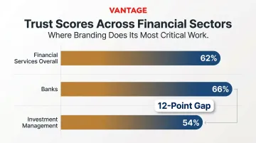
Yet trust in business remains relatively strong. According to the 2024 Edelman Trust Barometer for Malaysia, trust in business reached 75%, with Malaysia's overall Trust Index scoring 68—a six-point increase from the previous year.
For financial services specifically, global trust stands at 62%, with banks commanding 66% and investment management trailing at 54%. That gap is where branding does its most critical work.
Multicultural Communication Complexity
Malaysia's Chinese, Malay, and Indian consumer segments each carry distinct values around wealth, stability, and credibility. Research on ethnic bank selection criteria found that "secure feeling" ranked first across all three groups—but priorities diverge sharply from there:
- Malay consumers weighted branch location and marketing promotion more highly
- Indian consumers placed greater emphasis on word-of-mouth recommendations
- All segments responded differently to visual and messaging cues despite sharing a core trust priority
Colour associations diverge across cultures. Red signals urgency in Western contexts but represents good fortune in Eastern cultures—a critical consideration for Malaysian financial brands. One-size-fits-all visual identity becomes particularly dangerous when a single colour misjudgment can alienate an entire market segment.
Digital-First Pressure
Malaysia's fintech sector has exploded. More than 280 fintech companies operated in Malaysia in 2024, with e-payment transactions per capita rising 20% year-on-year to 343 transactions. All five Bank Negara Malaysia-licensed digital banks are now operational, with GXBank alone attracting nearly 1 million users within its first year.
Traditional financial brands must balance institutional gravitas with modern, approachable design or risk appearing outdated to younger, digitally-native investors. That balance is not a cosmetic choice. It determines whether established brands remain relevant as digital challengers capture their core customer base.
The Client: Golden Equator Group at a Crossroads
Golden Equator Group, established in 2012, operates a diversified financial services portfolio across three core divisions: Golden Equator Wealth (wealth management), Golden Equator Capital (venture capital), and Golden Equator Learning (professional development). The group serves both institutional and retail investor segments across Southeast Asia.
The Core Branding Problem
The business had grown rapidly, but its visual identity had not kept pace. The brand looked fragmented across digital channels, printed collateral, and investor-facing presentations. Each division operated with inconsistent messaging and visual standards, creating confusion among prospects and undermining confidence in the firm's capabilities.
For a financial services firm, this fragmentation carries real commercial risk. First impressions in investor pitch meetings form within seconds, and inconsistent branding signals operational uncertainty — precisely what investors don't want to see in a financial partner.
What Was at Stake
The rebrand coincided with Golden Equator's 10th anniversary and strategic expansion across Southeast Asia, including deeper penetration into Malaysia. The group needed to attract a broader investor base while maintaining credibility with existing institutional partners. The branding work was time-sensitive: get it right, and the new identity would carry the group into its next phase of regional growth.
Project Scope
The engagement included:
- Brand strategy and positioning
- Visual identity system (logomark, colour palette, typography)
- Brand messaging framework and voice guidelines
- Brand guidelines document
- Application across digital touchpoints (website, social media, investor portals)
- Physical applications (business cards, presentation decks, signage, event materials)
- Brand implementation workshop
Brand Discovery and Strategy: Finding the True Competitive Position
The Discovery Process
Vantage Branding began with stakeholder interviews across Golden Equator's leadership team and key divisions. The goal: uncover what clients actually valued—and where gaps existed between how the brand saw itself versus how clients perceived it.
Competitor brand audits revealed that most regional financial services firms positioned themselves on performance metrics alone: returns, track record, scale. Few communicated a distinctive philosophy or relationship-based value proposition.
The Positioning Work
The strategic choice centred on distinguishing Golden Equator not as a "returns-first" institution but as a "relationship-first" trusted partner—one that brings capital and community together. This positioning territory informed every subsequent design decision.
The brand promise emerged: "Bringing capital and community together to unlock limitless value." The phrase reflected Golden Equator's operational reality across its three divisions, where capital deployment, community engagement, and learning initiatives created synergies few competitors could match.
The Brand Story and Messaging Framework
Three brand pillars were developed:
- Visionaries Beyond Capital — positioning Golden Equator Capital as impact-driven, not purely transactional
- Building a Legacy of Wealth — emphasising multi-generational value creation through Golden Equator Wealth
- Collaboration and Growth — highlighting professional development and community-building through Golden Equator Learning

Tone of voice guidelines balanced authority with accessibility. For institutional partners, messaging emphasised track record and expertise. For retail investors, the tone became warmer, focusing on partnership and shared purpose.
Vantage Branding's Insight-Led Approach
What differentiated this process from purely aesthetic branding work was the grounding in business reality. Vantage Branding's research uncovered that Golden Equator's competitive advantage wasn't product features—it was the integrated ecosystem spanning capital, wealth, and learning that few competitors could replicate. Making that invisible advantage visible became the foundation for everything that followed.
Building the Visual Identity for a Finance Brand
Logomark and Symbol Design
The logomark features an animated geometric emblem composed of eight stylised shapes arranged in a circular pattern. The design conveys interconnection — each division distinct yet part of a unified whole.
Rather than defaulting to generic finance clichés — upward arrows, shields — the mark communicates stability through symmetry and growth through dynamic arrangement. Geometric precision signals professionalism. The circular form reinforces completeness and continuity, both critical to financial trust.
The mark was tested across digital small-scale contexts (app icons, LinkedIn thumbnails) and large-format applications (reception signage, investor presentation covers). Legibility remained strong at 16px and scaled beautifully to environmental graphics.
Colour Palette and Typography
Three deliberate decisions shaped the visual language:
| Element | Choice | Rationale |
|---|---|---|
| Primary colour | Warm metallic bronze | Sets Golden Equator apart from the navy-dominated finance category; warm tones signal prosperity without ostentation across Malaysian cultural contexts |
| Secondary colour | Deep brown | Grounds the palette with depth and stability; creates strong contrast on both light and dark backgrounds |
| Typography | Bold sans-serif | Balances professionalism with approachability; sized at 16px minimum for digital legibility, 17px for Chinese character rendering — a technical requirement for Southeast Asian audiences |
The bronze choice was particularly strategic. Most financial brands default to dark blue or grey, which reads as authoritative but distant. Bronze carries warmth and premium quality without the cold remove of silver or platinum — a distinction that matters when building trust across Bahasa Malaysia, Mandarin, and English-speaking segments.

Brand Applications Across Key Touchpoints
Digital Applications
The brand identity was applied across Golden Equator's website, featuring the messaging "Visionaries Beyond Capital" and "Creating positive social and commercial impact." The dark blue and black gradient design provided sophistication while the bronze accents ensured navigational clarity.
Mobile optimisation was critical—90% of Malaysian customers use digital banking. The design ensured credibility on first mobile impression, with fast-loading hero sections, clear value propositions above the fold, and intuitive navigation.
LinkedIn and social media posts featured two distinct formats: corporate milestone announcements and divisional campaigns. The 10th anniversary campaign used "New Dimensions and Possibilities" messaging, with division-specific content like "Building a Legacy of Wealth" for the Wealth division.
Physical and Print Applications
Each physical asset carried the brand system consistently:
- Investor presentation decks used consistent slide templates with bronze accents, geometric patterns echoing the logomark, and clear typography hierarchy—flexible enough for different investment opportunities without losing brand cohesion.
- Business cards and stationery featured the brand promise "Unlocking limitless value" on deep brown backgrounds with contrasting light fonts, with premium materials reinforcing the premium service positioning.
- Reception signage combined the geometric logo and bronze metallic branding against textured dark stone, creating immediate credibility for visiting institutional partners.
Brand Guidelines Document
Vantage Branding delivered a comprehensive brand guide, enabling Golden Equator to maintain consistency across all future communications without requiring agency involvement for every asset.
For a financial institution managing compliance-sensitive communications, this mattered. Regulatory disclosures, investor communications, and marketing materials could all adhere to brand standards while meeting legal requirements—handled in-house, on any timeline.
Results: The Business Impact of Strategic Finance Branding
Immediate Qualitative Outcomes
Leadership feedback highlighted improved confidence in investor pitch meetings. The unified brand identity signalled operational maturity and strategic clarity—qualities institutional investors actively seek. Internal teams reported stronger pride in representing the brand, with clear guidelines eliminating previous uncertainty about how to present Golden Equator across contexts.
Measurable Improvements
While specific conversion metrics remain confidential, the rebrand supported Golden Equator's regional expansion and 10th-anniversary positioning. Industry evidence points to real, measurable returns from brand investment:
- Banks undertaking strategic rebrands achieve 13.6% compound annual growth, far exceeding the 7.4% industry average
- In Malaysia's banking sector, collective brand value grew 25% year-on-year to $11.5 billion, with leading banks crediting brand strength investments as a key driver
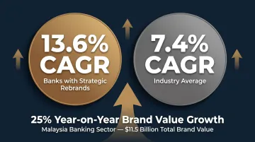
These figures illustrate what Golden Equator's rebrand was ultimately working toward—stronger positioning in a market where institutional trust is everything.
The Key Lesson
For Golden Equator, the most valuable outcome wasn't a new logo—it was a clearly defined strategic position and consistent visual language that the entire organisation could use to communicate confidence to every stakeholder, at every touchpoint. When brand strategy is done well, it shapes how every investor, partner, and client perceives the organisation—long after the design files are delivered.
Frequently Asked Questions
What are the Big 4 finance firms in Malaysia?
By brand value, the top four Malaysian banks are Maybank ($5.4 billion), CIMB Group ($2.7 billion), Public Bank ($1.6 billion), and RHB Bank. Even these dominant players invest heavily in brand differentiation to maintain consumer trust in Malaysia's competitive financial services landscape.
Why does branding matter for financial companies in Malaysia?
In a trust-driven industry, branding serves as the first credibility signal. A professional, consistent brand identity directly influences whether prospective clients or partners choose to engage, typically well before any conversation about products or performance begins.
What makes finance branding in Malaysia different from other industries?
Malaysia's multicultural audience, bilingual and multilingual communication needs (Bahasa Malaysia, English, Mandarin), and strict regulatory environment require finance brands to be especially precise in their visual and verbal identity choices. Generic approaches that work elsewhere often fail here.
How long does a finance branding project typically take?
A full brand strategy and identity project for a financial services firm typically ranges from 8 to 16 weeks, depending on scope, stakeholder review cycles, and brand architecture complexity. Implementation and rollout extend the timeline further.
What should a financial brand identity include beyond a logo?
A complete financial brand identity goes well beyond the logo. Core components include:
- Brand strategy and positioning
- Colour palette and typography system
- Brand voice and messaging guidelines
- Application templates for digital and print
- Brand standards documentation for internal teams, partners, and vendors