Introduction
Scan 20 law firm websites and you'll see the same visual vocabulary: navy blue headers, stock photos of marble columns, generic taglines about "trusted legal counsel." This uniformity isn't coincidental—it's a missed opportunity.
When every firm looks identical, potential clients default to price or proximity rather than trust and expertise. Research from the Legal Marketing Club found that 82% of clients rate their first impression of a law firm as critical to their hiring decision. Most firms squander that moment with forgettable branding.
Firms that consistently attract premium clients share one thing: a deliberate brand that communicates who they are before a single word is read. This article breaks down the essential elements of law firm branding, practical ideas to differentiate your firm, and real examples worth learning from.
TLDR
- Law firm branding encompasses your complete identity—logo, colours, messaging, tone, and client experience—not just visual design
- Consistent branding can increase revenue by 33% for professional services firms
- Effective brands are built on a clear unique selling proposition, defined visual identity, and consistency across every touchpoint
- The best law firm brands abandon generic legal imagery to speak directly to their target client
- Brands that endure follow a systematic process: audience research, visual identity development, and consistent execution
What Is Law Firm Branding (and Why It Matters)
Law firm branding is the process of establishing your firm's unique identity through visual design, messaging, client experience, and market positioning. It's the complete perception clients and prospects hold of your firm: not just your logo, but how every interaction feels and what your firm stands for.
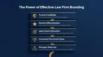
The business case is clear. Consistent branding increases revenue by 33% according to Lucidpress research, while McKinsey data shows that B2B companies with strong brands outperform weak brands by 20%. For law firms specifically, branding delivers:
- Trust and credibility with potential clients who need confidence before engaging legal services
- Market differentiation that makes your firm recognizable in a crowded field
- Ideal client attraction by speaking directly to the clients you want to serve
- Increased perceived value that supports premium pricing
- Stronger referrals by making your firm memorable and easy to recommend
Each of these outcomes connects to how clients actually make decisions. Harvard research on client choice identified 27 qualities that drive legal service decisions — and expertise alone rarely wins. Clients weigh it alongside trust signals, service quality, and how well a firm understands their specific situation. Your brand shapes that perception before a single conversation takes place.
Key Elements of Effective Law Firm Branding
Brand Name and Tagline
Your firm name and tagline create the first impression and should communicate focus, personality, or promise. A strong tagline distills your value into a memorable one-liner that resonates with your target client.
Traditional law firms use partner names (conventional but safe), while newer firms increasingly choose names that signal their practice focus or approach. Your tagline should answer the unspoken question: "Why should I choose you?"
Logo Design
A well-designed logo encodes your firm's personality, practice area, and values into a visual mark that must work across business cards, websites, signage, and social media. The choice between logo types matters:
- Wordmarks use typography alone (the firm name styled distinctively)
- Glyphs (symbols) are standalone icons — useful for digital avatars, app icons, and contexts where a text mark is too small
- Combination marks pair both elements for maximum flexibility
Wordmarks work well for established firms trading on their name. Symbols scale better across small digital applications. Combination marks offer the most versatility but require stronger design execution.
Colour Palette and Typography
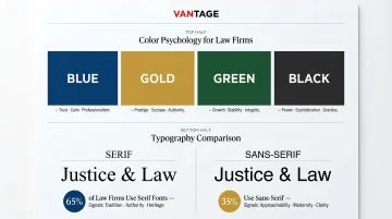
Between 62% and 90% of initial decisions are based on colour — which makes your palette a strategic decision, not a cosmetic one.
Common legal colour associations:
- Blue: Trust, calm, professionalism (nearly half of law firms use blue as their primary colour)
- Gold/Yellow: Prestige, authority, energy when paired with black
- Green: Growth, balance, creativity
- Black: Authority, sophistication, formality
Typography carries equal weight. Approximately 65% of law firms use serif fonts in their logos — a signal of tradition and authority. Sans-serif fonts convey approachability and modernity, making them particularly effective for firms targeting younger clients or positioning as disruptors.
The key is matching these choices to your target client's expectations and emotional state, not just following industry convention.
Brand Messaging and USP
Your Unique Selling Proposition (USP) is the foundation of all brand messaging—from website copy and attorney bios to social media and intake scripts. A strong USP answers: what makes your firm distinctly valuable to your specific clients?
Common USP formula: "We help [AUDIENCE] achieve [TRANSFORMATION] with [SERVICE]"
Examples for law firms:
- "We help creative professionals protect their intellectual property with fast, affordable trademark services"
- "We help injured workers secure maximum compensation with aggressive litigation and personalised advocacy"
Your USP should appear consistently across every touchpoint, creating a unified story about who you serve and what you deliver.
Consistency Across All Touchpoints
Branding is only as strong as its consistency. Letterheads, email signatures, office interiors, website design, social media profiles, and client communications should all feel like parts of the same story.
Inconsistency erodes trust. When your website looks modern but your client portal feels dated, or your social media voice contradicts your in-office experience, clients notice and question your attention to detail.
Brand guidelines prevent this by documenting:
- Approved logo variations and minimum sizes
- Colour specifications (hex codes, Pantone values)
- Typography rules for different applications
- Tone of voice standards
- Image and photography style
Think of brand guidelines as the rulebook that keeps every touchpoint — from a junior associate's email signature to a billboard — telling the same story.
Best Law Firm Branding Ideas
Define Your Audience Before Your Aesthetic
The most common branding mistake law firms make is designing for themselves rather than their clients. Partners choose colours they personally prefer or aesthetics that appeal to other lawyers—missing the point entirely.
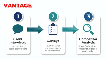
Effective branding begins with audience research:
- Client interviews to understand their fears, goals, and expectations
- Surveys to quantify what matters most in their legal service selection
- Competitor analysis to identify visual and messaging gaps in your market
A family law firm serving divorcing parents should look and sound completely different from a corporate litigation firm representing Fortune 500 companies. Your brand should speak to your clients' emotional state and professional expectations.
Break From Generic Legal Imagery
Move away from stock photos of gavels, courtrooms, and scales of justice. These symbols signal "generic law firm"—exactly what you're trying to avoid.
BethanyWorks research identifies scales of justice, columns, navy blue, and gold serif fonts as making differentiation "nearly impossible." Firms relying on these elements become invisible in the market.
Instead, use imagery that reflects your firm's personality and client profile:
- Show people, not props — Real attorneys, real clients (with permission), real moments
- Match your practice personality — A creative-sector law firm should look nothing like a corporate litigation firm
- Use authentic photography — Avoid generic stock images of courtrooms no one recognises
- Consider unexpected colours — Bright accents, warm tones, or bold contrasts that signal approachability
Build a Thought Leadership Brand
Publishing useful legal content—blogs, guides, LinkedIn articles, podcasts—positions attorneys as trusted experts and extends your brand beyond visual identity.
The 2024 Edelman-LinkedIn B2B Thought Leadership Report found that 75% of decision-makers say thought leadership led them to research a service they weren't previously considering, while 73% consider it more trustworthy than traditional marketing materials.
For law firms, this means:
- Writing about sector-specific legal developments
- Publishing practical guides that answer common client questions
- Sharing scenario analyses and case reflections
- Demonstrating expertise through clear, accessible explanations
The key is consistency: your content voice should feel like a natural extension of your visual brand, not a separate channel running in parallel.
Extend Branding to the Client Experience
The client experience—from first phone call through document delivery to follow-up—is itself a branding statement. Every interaction either reinforces or undermines your visual identity and messaging.
Consider these touchpoints:
- Intake scripts that reflect your brand voice (formal vs. conversational)
- Client portals designed with your visual identity
- Document templates using your brand colours and typography
- Follow-up communications maintaining consistent tone
- Office environment matching your brand personality
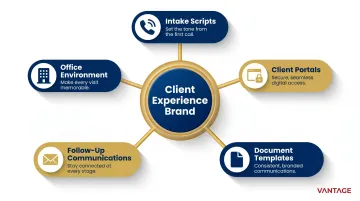
A polished brand loses impact when the intake process feels generic or document delivery looks outdated. Consistency across the entire client journey creates a cohesive, professional brand impression.
Knowing When It's Time to Rebrand
Strategic rebrands signalling growth and evolution. Common triggers include:
- Firm name changes following mergers or partner departures
- Mergers and acquisitions requiring unified visual identity
- Practice area pivots when your visual identity no longer matches your focus
- Market repositioning to appeal to different clients or premium segments
- Becoming too generic in a changing market where differentiation matters more
The goal isn't reinvention for its own sake—it's closing the gap between how your firm presents itself and who it has actually become.
Best Law Firm Branding Examples
Each example below demonstrates a distinct branding principle that law firms can learn from and adapt—spanning different practice areas, firm sizes, and aesthetic approaches.
Berger Montague
Berger Montague is a class action litigation firm whose branding radiates authority through bold consistency. Their website prominently displays power statements like "We are the nation's premier litigation law firm" and backs claims with quantified credibility: $55B+ in settlements, 55+ years of experience, 100+ attorneys.
The brand communicates self-confidence—exactly what clients in high-stakes litigation want from their legal team. Several specific choices drive this:
- The logo repeats as a pattern element throughout the site (not just in the header), creating visual cohesion
- A dedicated "Judicial Praise" section features direct quotes from Chief Judges and Federal Judges, drawing on third-party credibility
- ALL-CAPS power words (FORCE, POWERHOUSE, BILLIONS) paired with hard settlement figures leave no room for doubt about the firm's standing
Hello Divorce
Hello Divorce redefines how legal services can be branded, using a tech-forward, consumer-app aesthetic that intentionally avoids anything traditional or intimidating. Their headline captures the positioning perfectly: "Divorce is hard. The legal part doesn't have to be."
Every design choice signals "we're different from the law firms you're afraid of." The brand matches the emotional state of its target client—people in the middle of divorce who want clarity, not more stress:
- An AI mascot named "Hallie" gives the service a friendly, tech-product feel
- Step-by-step timeline visualizations reduce the process to manageable stages
- Action-oriented CTAs like "Find The Plan For You" replace generic legal language
Notably, the firm reports that 50% of its customers are high-net-worth clients actively avoiding drawn-out litigation—proof that approachable branding doesn't mean budget positioning.
Output Law
Output Law serves creative professionals (music, film, art, audiovisual) with a website that looks more like a modern gallery than a law office. Black-and-white minimalist palette, sans-serif all-caps typography, and significant white space create a visual identity that signals cultural fluency.
The brand tells creative clients "we understand your world" without a single explanatory sentence—design does all the talking:
- "+" symbols replace "and," and headers end with periods, mimicking editorial and art direction conventions
- Casual language ("quick gut check," "Let's chat") replaces formal legal copy throughout
- A live Instagram feed (@outputlaw) embedded on the homepage keeps the brand consistent across platforms
For firms targeting niche creative industries, this is the clearest example of how audience alignment through design can replace the need for traditional legal authority signals.
Ben Crump Law
Ben Crump Law is a high-profile personal injury and civil rights firm whose branding centres on bold typography, strong colour contrast (black, gold, red), and scalable visual elements. The wordmark itself functions as the primary visual anchor, styled for news and media recognition.
The combination of strong typography and deliberate colour psychology ensures immediate recognition across media—from billboard to mobile screen. Key execution choices include:
- Modular "settlement/verdict cards" display high-profile case results (George Floyd, Breonna Taylor, $2B Black Farmers settlement) in a format that scans in seconds
- Red accents drive urgency at decision points: "No Fees Until We Win," "Available 24/7"
- National presence (offices in 8 states) is stated alongside personal advocacy language, achieving authority without distance
Stacey-Ann Taylor Law
Stacey-Ann Taylor Law is a smaller firm whose branding centres on connection and approachability. The creative use of the firm's initials, warm colour choices, and welcoming messaging create a brand that feels personal rather than corporate.
The branding reflects the founder's personal approach directly—headlines like "Protecting Your Business & Brand" and first-person language ("I'm here to help") position the attorney as a "Back-Pocket Legal Biz Specialist" rather than distant counsel. The positioning is specific enough to attract exactly the right clients without trying to appeal to everyone.
A small firm with a clear point of view will outperform a large firm with a vague one. Stacey-Ann Taylor Law makes that case plainly.
Frequently Asked Questions
What is the difference between law firm branding and marketing?
Branding defines your firm's identity, values, and visual language. Marketing is how you communicate and promote that identity to the world. Branding comes first — it informs every marketing decision and creates the foundation for consistent messaging across advertising, content, and client outreach.
What colours work best for a law firm logo?
Blue is the most common choice (trust, calm, professionalism), but firms increasingly use gold (prestige), green (growth, balance), or bold accent colours to stand out. The best colour depends on your firm's target client and practice area personality—family law might benefit from warm, approachable tones, while corporate litigation may favour traditional authority signals.
How much does professional law firm branding typically cost?
Costs vary by scope. Freelance logo design typically starts from SGD 350–1,000, while mid-tier agency packages covering logo, tagline, and messaging run SGD 1,500–7,000. Comprehensive brand strategy with full implementation can reach SGD 50,000 or more. Your investment should reflect your firm's growth ambitions — established firms competing for premium clients benefit from end-to-end strategy, while solo practitioners may start with logo and messaging alone.
When should a law firm consider rebranding?
Common triggers include firm name changes, mergers, practice area pivots, or a brand that no longer reflects your current identity or target clients. If your visual identity feels dated or indistinguishable from competitors, a strategic rebrand signals evolution and renewed relevance.
What are the most common law firm branding mistakes to avoid?
The most common pitfalls are:
- Defaulting to generic legal imagery (gavels, scales of justice)
- Inconsistent visual and verbal identity across platforms
- Designing for partners rather than target clients
- Treating the logo as the whole brand, not one element of a broader system
- Overusing buzzwords without substance
- Skipping brand guidelines, which leads to inconsistent execution
Does a law firm need to trademark its logo?
Federal trademark registration is not legally required but strongly recommended. Common-law rights are geographically limited to where you use the mark, while federal registration in the US provides nationwide protection and stronger enforcement options. In Singapore, IPOS trademark registration costs SGD 280-380 per class and grants a 10-year renewable monopoly over your mark—affordable protection for your brand investment.
Conclusion
Strong law firm branding is a strategic business asset, not a cosmetic exercise. When your visual identity, messaging, client experience, and content work together, your firm becomes recognisable, referral-worthy, and resilient to competition.
For law firms in Singapore and across Asia, Vantage Branding builds brands grounded in audience research and market positioning — covering everything from brand strategy and logo design to messaging frameworks and guidelines. The focus is on building something that holds up as your firm grows, not just something that looks good at launch.