What Makes a Good Logo: Essential Design Tips
Discover what makes a good logo design; simple, memorable, versatile, and reflective of your brand identity. Craft a timeless logo. Click now!
•
Discover what makes a good logo design; simple, memorable, versatile, and reflective of your brand identity. Craft a timeless logo. Click now!

In a world where customers scroll faster than they think, your logo often speaks before you do. Most people will meet your brand on a screen: your website, Shopee listing, Instagram feed, or even a tiny WhatsApp icon. No handshake, no conversation, just a split-second visual decision. A strong logo whispers, "You can trust us." A weak one screams, "Maybe not."
Singapore is a battleground of small businesses competing online. Two cafés may sell identical kaya toast, two gyms may offer the same kettlebell classes, but the brand that looks polished instantly feels more reliable. A great logo separates the "serious business" from the "still figuring it out," even before customers taste your coffee or step into your studio.
Here's the plot twist: you don't need a huge budget. Many local SMEs start with DIY branding and still look razor-sharp when they follow the right design rules. A great logo becomes more than a picture. In this blog, we will discuss what sets a good logo apart from a great one.
In a nutshell:
A strong logo is more than decoration. It's a visual shortcut that tells customers who you are, what you stand for, and why they should trust you over the shop next door (or next scroll). While trends will come and go like bubble tea flavours, great logos share a common core DNA: they are simple, memorable, scalable, versatile, relevant, and consistent.
Below is a clear breakdown of what each trait means, along with real-world examples from global brands that got it right.
A simple logo is easier to recognise, easier to remember, and to use. When there are fewer shapes, colours, or details competing for attention, the brain can identify the design much faster.
People only glance at logos for a split second, especially online, so simplicity helps them register the brand instantly. A clean logo also stays clear when it's printed small, used on social media, placed on packaging, or even embroidered on a polo shirt.
Why it matters:
Real examples:
The brutal truth: If a logo needs explaining, it's already too complex.
A strong logo "sticks" after just one glance. Memorability comes from distinctive shapes, unique typography, or a clever visual idea that sets the brand apart like a neon sign in a grey mall.
If customers can recall your logo without seeing it, that's a win. A memorable logo helps with recommendations too: people can describe it, point it out in supermarkets, or recognise it on a crowded shelf.
Think of the McDonald's arches or Grab's winding green lines: once you've seen them, they're burned into your brain.
Why it matters:
Real examples:
The rule: The more distinctive the logo, the easier it is to recall when it matters most at the point of purchase.
A logo should look just as commanding on a giant billboard as it does on a tiny mobile icon. If a logo becomes blurry, overly detailed, or unreadable when shrunk, it loses its entire purpose.
Scalability is life-or-death in a digital-first world where customers often see brands on screens smaller than a playing card. Bold shapes and clear fonts help the logo stay crisp, whether it appears on Shopee listings, WhatsApp Business profiles, or product labels the size of a postage stamp.
Why it matters:
Real examples:
The test: If a logo only looks good when big, it's not practical. And impractical means invisible.
A versatile logo works in every environment: full colour, black and white, dark backgrounds, light backgrounds, landscape or square formats. Brands today appear on websites, packaging, posters, Instagram, receipts, staff shirts, and delivery bags.
A logo that only works in one style becomes a design nightmare and an expensive burden. The most flexible logos look consistent everywhere, without needing to be redrawn, adjusted, or "fixed" every single time.
Why it matters:
Real examples:
The standard: A logo should survive any environment without losing its soul.
A good logo feels like it belongs to the brand it represents. The style, colours, shapes, and fonts should communicate the right personality without a single word. A serious financial company should not look like a children's toy shop, and a playful café should not look like a funeral parlour.
Relevance helps customers immediately understand what type of business you are.
Why it matters:
Real examples:
The instinct: Customers intuitively feel when a logo fits, or when something's just… off.
A logo should match the brand's messaging, visuals, and overall personality like a well-tailored suit. If the logo feels fun but the website feels corporate, customers sense a disconnect, and their trust radar starts beeping.
Consistency creates trust and professionalism. When the logo, colours, fonts, and voice all work together, the brand feels reliable and well thought-out.
Why it matters:
Real examples:
The proof: If the logo and brand voice feel like they belong together, customers perceive reliability. If they clash, customers smell fear.
A great logo is not an artistic exercise or a designer's vanity project; it's a business asset. When a logo is simple, memorable, scalable, versatile, relevant, and consistent, it becomes a powerful tool that helps a brand look professional, build trust, and stay recognisable for years without needing constant facelifts.
If you want a logo that sticks, that's where Vantage comes in.
Let's build something people actually remember. Contact us today.
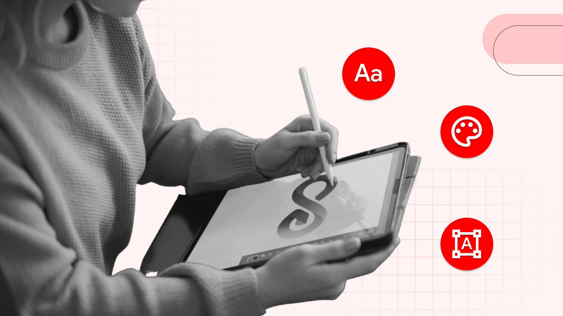
Once a business understands what makes a good logo, the next step is knowing how to actually build one. A high-quality logo is not created by accident, divine inspiration, or copying a competitor; it comes from deliberate decisions about icons, typography, colour, space, and usability.
Below are the core elements that influence how professional and effective a logo will look in the wild.
Different styles of logos create different impressions, and choosing the wrong one is like showing up to a job interview in a clown suit.
Typography is often underestimated, but fonts tell a story before a single word is read. Fonts are like accents; they instantly signal where you're from and what you're about.
For example:
The warning: The wrong font can instantly send the wrong message, even if the design looks attractive. Comic Sans for a law firm? Please don't.
Colour carries emotion, and different colours influence how customers feel about a brand before they even read the name.
In Singapore, many F&B businesses choose red or yellow because they feel lively, appetising, and impossible to ignore. Financial brands often stay with blue for trust and stability. The key is choosing colours that fit your personality, not just what looks trendy on Dribbble this month.
Negative space refers to the empty areas around or inside a logo. Good designers use space deliberately to make a logo look clean, modern, and balanced, not cluttered like a hawker centre at lunchtime.
Some logos even use negative space creatively, like:
Even simple spacing choices can make a logo feel more polished and professional versus "I made this in Canva during lunch."
A logo that looks great on a laptop but terrible on a mobile screen is not future-proof; it's already obsolete. Today, customers see logos on:
This means fonts must be legible, shapes must be clear, and details must remain sharp even when reduced to a tiny square. If someone squints to read your brand name, the logo needs urgent refinement or a complete overhaul.
The takeaway: High-quality logos come from thoughtful design decisions, not luck or templates. Whether the logo uses an icon, symbol, or abstract mark, the typography, colour, and spacing must work together to create clarity and recognition across every digital touchpoint because that's where your customers actually are.
Also Read: What Is Brand Communication? The Ultimate Guide for B2B Businesses
Designing a great logo is not about picking a random template, slapping on trendy colours, or hoping for the best. A strong logo comes from intentional choices that reflect the brand's personality and values.
Here's a simple step-by-step approach that any business can follow, no design degree required.
Before sketching anything or opening Canva, think about the brand itself. Who are your customers? What tone should the logo communicate? What problem do you solve, and how should people feel when they see your brand?
A financial service should feel trustworthy and serious, while a café might feel warm, playful, and slightly indulgent. Without a clear brand strategy, even a beautiful design can feel disconnected, like wearing a tuxedo to a beach party.
Every logo fits into a style: literal icons, symbolic shapes, or abstract marks. Literal icons are easy for customers to understand because they represent something real, like a cupcake, a camera, or a house.
Symbols communicate ideas, such as security, movement, or innovation. Abstract shapes are unique and modern, but require more brand consistency to build recognition. Choosing the right style ensures that your logo reflects your personality, not someone else's hand-me-down aesthetic.
Fonts change the tone of a brand instantly. Capital letters feel bold and authoritative. "We mean business." Lowercase letters feel modern and friendly, "we're approachable." Serif fonts often look premium and elegant, while sans-serif fonts look clean, contemporary, and no-nonsense.
The typography should match your personality. A legal firm and a children's enrichment centre should never use the same style of font.
Spacing is what separates professional logos from homemade ones that look like they were designed in Microsoft Word. When letters or icons feel cramped, the design looks messy and rushed. When there's enough space to breathe, the logo appears confident and polished.
Balance also matters; the logo should not feel heavier on one side like a lopsided cake. A well-balanced design is easier on the eye and looks more premium.
A tagline can help when the brand name doesn't clearly describe the business. However, taglines often become unreadable in small sizes, especially on social media, where they turn into blurry smudges.
If the tagline becomes tiny or distracts from the main logo, it's better to remove it. A logo should always work with and without the tagline; it shouldn't need a crutch.
Most customers first see businesses on mobile screens. A logo should remain sharp and recognisable at very small sizes. If the text becomes fuzzy or the icon loses detail, the design needs to be simplified immediately.
A strong logo looks just as good on a shopfront as it does inside a small Instagram profile picture, no compromises.
The final logo should always be saved in a vector format such as AI, SVG, or EPS. Vectors stay crisp at any size, while JPG and PNG can become blurry when enlarged. If a business plans to print signage, uniforms, or merchandise, vector files are essential for professional results.
Also Read: Top 10 B2B Branding Companies in Singapore
Great brands aren't built by luck, divine intervention, or hoping for the best; they're built through intentional identity, consistent visuals, and real customer trust.
The lesson from the world's most recognisable logos is simple: clarity outlasts trends, simplicity scales better than decoration, and consistency wins attention in a crowded digital world.
When your logo works everywhere on screens, storefronts, packaging, and social feed, your brand becomes familiar, memorable, and trusted. And trust, in case you haven't noticed, is currency.
If your logo isn't building recognition, it's losing it.
Contact Vantage today and build a logo that customers won't forget.
1. Do small businesses really need a professional logo?
Not always. Many SMEs start with DIY logos and upgrade later as they grow. What matters most is clarity, legibility, and consistency. A clean, simple logo can still look professional without a big budget; you just need to follow the right principles.
2. How many colours should a good logo use?
Most strong logos use one or two main colours. Too many colours can look messy, hard to remember, and even harder to print. If the logo works in black and white, it's usually a good sign that it's built on solid foundations.
3. Should a logo include a tagline?
Only if it remains readable at small sizes, if the tagline makes the logo crowded or disappears into a blurry smudge, it can detract from the overall design and impact of the logo itself.
4. What file formats should a logo be delivered in?
Vector formats like AI, EPS, and SVG are designed to remain sharp and clear at any size, making them ideal for high-quality graphics in various design applications.
5. How often should a business refresh its logo?
Most brands refresh every 5–10 years. Not to change the entire identity, but to stay modern and improve clarity. If the logo feels outdated, inconsistent, or hard to read, it may be time for an update.
.jpg)


Partner with us to experience strategic creative excellence that drives real business results


